
![]()
I made logo for my cousin’s wife when she started her cell phone company. She wanted the Raga, Rastafarian feel with the bright colors. I created the font for the “IRIE” myself because I couldn’t find a font that I liked. I then finalized the logo with the illustration of the person leaning on the logo with dreadlocks and the Jamaican robe.
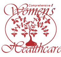
I made this logo for a women’s healthcare clinic in Arizona. They wanted a theme with the tree of life and how it continues to blossom and grow. I decided to go with the script font to give it the elegance that a woman deserves. I decided to not show the roots, but rather a strong foundation to the tree that can stand on it’s own. In addition, if the tree is turned upside down it looks like a heart giving life to the tree which represents the nurturing power of a woman.
![]()
This is the logo I made for David Smith as he ran for congress in Ohio. The flag looks a lot like the state flag with the triangle. The word logo is written in Americana which fit perfectly since he was running for a congressional seat.
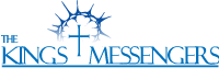
The Kin’s Messengers are a gospel Group out of Wise County Virginia. They had already released eight CD prior to me working with them. I made this logo as it represents what they stood for. I made the crown of thorns to look like a sun rise over the cross to represent the Son has risen.
![]()
The Virginia Cross ties is a bluegrass group that did many concerts around Virginia and Kentucky. I decided to go with a font that felt a little scratchy and thrown together as it represented the group well. I made the o into a banjo as that is a typical instrument in a blue grass band. If I were to go back and do this logo again, I would probably change the font to be something other than Papyrus as it is over used by a lot of people.
![]()
I made this logo for the New Mexico Space Alliance group. They were getting started and wanted to show a connection between earth and space. I came up with the concept of connecting earth and space like a puzzle peace because for nature of what they were doing. It required a lot of cooperation, concentration, time to get into space with no government funding.
![]()
This is a company that my brother and sister-in-law wanted to start. She had great ideas of how to put together party ideas on a very limited budget. This would be packets put together with everything you needed to pull off the perfect party for children. I went with the bright colors to show it is upbeat and fun. I decided to do a flower as the P and have confetti be scattered through out the logo. I decided to go with a script font for planner because I wanted to show that it was a fun, but organized company.
Inside Out Advanced Medicine
I made this logo for a company that bought out a previous owner. They wanted a new name and feel but wanted to show that it was the same company. I implemented their name and the design of their old logo elements.
Personal Logo
I made this log to represent my wife and myself. It has the letters of S for Spencer and H for Heather that can be seen when looking at it closely. I also made it to look like an hour glass to represent the various aspects of time that influence our life.